The IconView component (gb.qt4) implements a control that can display labeled icons. IconView elements are indexed by a key. The component has an internal cursor for accessing its elements. Use the MoveFirst, MoveNext, MovePrevious, MoveBack or MoveTo methods to move the internal cursor and the Item property to display the current element.
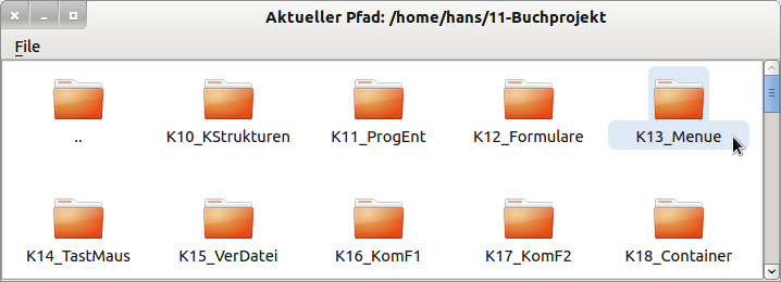
Figure 17.6.1: IconView in the Project Explorer
The Project Explorer in the examples of Gambas under the heading Miscellaneous uses an IconView to display the directory structure.
The following 2 tables describe selected properties and methods of an IconView:
Property | Type | Description |
---|---|---|
Ascending | Boolean | Shows whether the elements in an IconView are sorted in ascending order or not (→ descending). |
Compare | Integer | Use this property to return the result of a compare in the compare event (0, 1 or -1). |
Count | Integer | Returns the number of elements in the IconView. |
Current | IconView.item | Returns the current selected element in the IconView. |
Editable | Boolean | Indicates whether the elements are editable by default when an element is selected. With the function key F2 the edit mode is started and with Enter the changed text is accepted. |
GridSize | Integer | Returns the grid size of the IconView or sets the value. |
IconLines | Integer | Returns the maximum number of lines written with a symbol or sets the value. |
IconSize | Integer | Returns the size of the largest symbol in the IconView. |
Key | String | Returns the key string of the current element in the IconView. |
Mode | Integer | Determines or sets the selection mode (constants: Select.None (0), Select.Single (1) or Select.Multiple (2). |
Orientation | Integer | Returns the alignment of the displayed text and icon or sets the value with Arrange.Vertical or Arrange.Horizontal. |
Sorted | Boolean | Determines whether the elements in the IconView are displayed sorted or not. |
Picture | Picture | Returns the image set as the background image of the IconView or sets the image. |
Renaming | Boolean | Returns True if an element of the IconView has been renamed. |
Table 17.6.1.1: Selected properties of the component IconView
You can assign a self-defined context menu to an IconView, which you call by clicking with the right mouse button (RMT).
The alignment of the displayed text and the icon can take the values Arrange.vertical (text under the icon and vertical display of the icon) or Arrange.horizontal (text next to the icon and horizontal display of the icon).
Methods of an IconView:
Method | Description |
---|---|
Add ( Key As String, Text As String [ , Picture As Picture, After As String ] ) As _IconView_Item | Inserts an item into the IconView. Key is the key of the new element. Text is the text of the new element. Picture and After are optional parameters. Picture displays the image above the text. If the After parameter is set, insertion takes place at the position defined by After, otherwise at the end of the IconView. |
Clear() | Deletes the content of the IconView. |
Exist ( Key As String ) As Boolean | Returns True if the element with the specified key exists. |
Remove(Key As String) | Deletes the element with the specified key from the IconView. |
SelectAll() | Selects and selects all elements in the IconView depending on the .mode property. |
Unselect() | Deselects the selected elements in the IconView. |
MoveFirst() | Moves the internal cursor to the first element of the IconView. The function returns True if the IconView is empty. |
MoveNext() | Moves the internal cursor to the next element of the IconView. The function returns True if the next element does not exist. |
MovePrevious() | Moves the internal cursor to the previous element of the IconView. The function returns True if the previous element does not exist. |
MoveTo ( Key As String ) | Moves the internal cursor to the element with the specified key. The function returns True if the element does not exist. |
MoveBack() | If one of the above Move methods fails (return value True), you can use this function to move the internal cursor to its original position. Returns True if the internal cursor was not at a valid position. |
Special events of the IconView component can be found here:
Event | Description |
---|---|
Activate | Is triggered when the user double-clicks on an icon in the IconView. |
Cancel | This event is triggered when the user cancels a rename. |
Click | Is triggered when an element in the IconView is clicked and thus selected. |
Compare | This event is triggered when two elements of an IconView are compared. The result of the comparison must be saved in the Compare property of the IconView. |
Select | Is triggered when the selection changes. |
Rename | Is triggered when the user has renamed an entry. |
Table 17.6.2.1: Overview of events of an IconView
You can use the IconView.sorted property to display the elements in an IconView sorted by the displayed text. The property IconView.Compare and the event IconView_Compare(Key As String, OtherKey As String) also enable you to sort by user-defined criteria. Use the Compare property to display the result of the comparison of a Compare event. The return value of the comparison is valid:
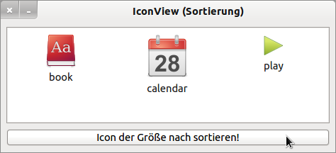
Figure 17.6.3.1: IconView with three elements
The order of the display at program start is determined by the order in which the IconView is filled → Figure 17.6.3.1.
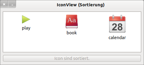
Figure 17.6.3.2: IconView with sorted elements
After sorting with the sort criterion Image.width ∗ Image.height the display has changed → Figure 17.6.3.2. The source text is fully specified:
' Gambas class file Public Sub Form_Open() Dim aPaths As String[] = ["icon:/48/book", "icon:/64/calendar", "icon:/32/play"] Dim sPath As String FMain.Center FMain.Resizable = False ' Als Key wird der Pfad zum Bild gewählt. For Each sPath In aPaths ivwIcons.Add(sPath, File.BaseName(sPath), Picture[sPath]) ' Füllen der IconView Next ' sPath End ' Form_Open() Public Sub ivwIcons_Compare(Key As String, OtherKey As String) Dim iSize, iOtherSize As Integer ' Sortier-Kriterium: Bild.Breite * Bild.Höhe With ivwIcons[Key].Picture iSize = .W * .H End With With ivwIcons[OtherKey].Picture iOtherSize = .W * .H End With ivwIcons.Compare = IIf(iSize = iOtherSize, 0, IIf(iSize > iOtherSize, 1, -1)) ' Alternative: ' ivwIcons.Compare = Sgn(iSize - iOtherSize) End Public Sub btnSort_Click() ' Nach dem Setzen von ivwIcons.Sorted auf True wird das IconView im Hintergrund ' eine Reihe von Compare-Events auslösen, um die Liste sortieren zu lassen. ' Wird ivwIcons.Sorted auf False gesetzt, dann wird nicht weiter sortiert. ivwIcons.Sorted = Not ivwIcons.Sorted If ivwIcons.Sorted Then btnSort.Text = ("Icon sind sortiert.") btnSort.Enabled = False Endif ' ivwIcons.Sorted = True ? End ' btnSort_Click()
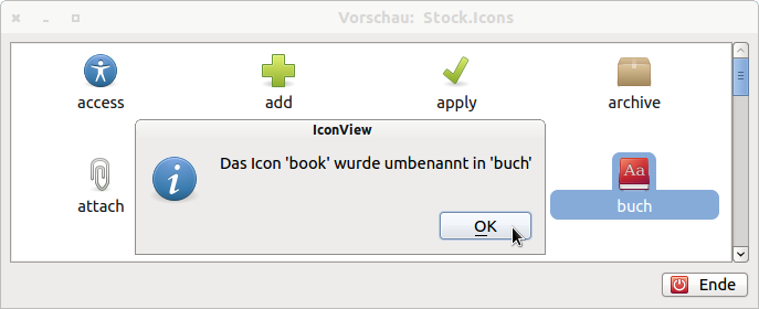
If you set the IconView.editable property to True, you can set a selected element to edit mode with F2, change the text and exit edit mode with Enter. The changed text is copied:
Figure 17.6.4.1: IconView - Rename elements
The extract from the source code allows the edit mode for an icon view with saving of the old text of the renamed icon:
Private $sLastIconName As String Public Sub Form_Open() FMain.Center FMain.Resizable = True ... IconView.Editable = True End ' Form_Open() Public Sub IconView_Rename() Message.Info("Das Icon '" & $sLastIconName & "' wurde umbenannt in " & "'" & \\ IconView.Current.Text & "'") End ' IconView_Rename() Public Sub IconView_Select() $sLastIconName = IconView.Current.Text End ' IconView_Select()
Die Komponente IconView (gb.qt4) implementiert ein Steuerelement, das beschriftete Symbole anzeigen kann. IconView-Elemente werden durch einen Schlüssel indiziert. Die Komponente verfügt über einen internen Cursor für den Zugriff auf seine Elemente. Verwenden Sie u.a. die Methoden MoveFirst, MoveNext, MovePrevious, MoveBack oder MoveTo, um den internen Cursor zu bewegen und die Item-Eigenschaft, um das aktuelle Element anzuzeigen.
Abbildung 17.6.1: IconView im Projekt Explorer
Das Projekt Explorer in den Beispielen von Gambas unter der Rubrik Verschiedenes nutzt eine IconView für die Anzeige der Verzeichnisstruktur.
In den folgenden 2 Tabellen werden ausgewählte Eigenschaften und Methoden einer IconView beschrieben:
Eigenschaft | Typ | Beschreibung |
---|---|---|
Ascending | Boolean | Zeigt an, ob die Elemente in einer IconView aufsteigend sortiert werden oder nicht (→ absteigend). |
Compare | Integer | Verwenden Sie diese Eigenschaft, um das Ergebnis eines Vergleichs im Compare-Ereignis zurückzugeben (0, 1 oder -1). |
Count | Integer | Gibt die Anzahl der Elemente in der IconView an. |
Current | IconView.Item | Liefert das aktuelle, ausgewählte Element in der IconView. |
Editable | Boolean | Gibt an, ob die Elemente standardmäßig editierbar sind, wenn ein Element ausgewählt wurde. Mit der Funktionstaste F2 wird der Edit-Modus gestartet und mit Enter der geänderte Text übernommen. |
GridSize | Integer | Gibt die Gittergröße der IconView zurück oder setzt den Wert. |
IconLines | Integer | Gibt die maximale Anzahl der Zeilen zurück, die mit einem Symbol geschrieben werden oder setzt den Wert. |
IconSize | Integer | Gibt die Größe des größten Symbol in der IconView zurück. |
Key | String | Gibt den Key-String des aktuellen Elements in der IconView zurück. |
Mode | Integer | Ermittelt den Selektions-Modus oder legt ihn fest (Konstanten: Select.None (0), Select.Single (1) oder Select.Multiple (2). |
Orientation | Integer | Gibt die Ausrichtung des angezeigten Textes und des Icon zurück oder setzt den Wert mit Arrange.Vertical oder Arrange.Horizontal. |
Sorted | Boolean | Legt fest, ob die Elemente in der IconView sortiert angezeigt werden oder nicht. |
Picture | Picture | Gibt das Bild zurück, das als Hintergrundbild der IconView festgelegt wurde oder setzt das Bild. |
Renaming | Boolean | Gibt True zurück, wenn ein Element der IconView umbenannt wurde. |
Tabelle 17.6.1.1: Ausgewählte Eigenschaften der Komponente IconView
Sie können einer IconView ein selbst definiertes Kontext-Menü zuordnen, das Sie über einen Klick mit der rechten Maustaste (RMT) aufrufen.
Die Ausrichtung des angezeigten Textes und des Icon kann die Werte Arrange.Vertical (Text unter dem Icon und vertikale Anzeige der Icon) oder Arrange.Horizontal (Text neben dem Icon und horizontale Anzeige der Icon) annehmen.
Methoden einer IconView:
Methode | Beschreibung |
---|---|
Add ( Key As String, Text As String [ , Picture As Picture, After As String ] ) As _IconView_Item | Fügt ein Element (Item) in die IconView ein. Key ist der Schlüssel des neuen Elements. Text ist der Text des neuen Elements. Picture und After sind optionale Parameter. Mit Picture wird das Bild über dem Text angezeigt. Ist der Parameter After gesetzt, dann erfolgt das Einfügen an der durch After definierten Position, sonst am Ende der IconView. |
Clear() | Löscht den Inhalt der IconView. |
Exist ( Key As String ) As Boolean | Gibt True zurück, wenn das Element mit dem angegebenen Schlüssel existiert. |
Remove(Key As String) | Löscht das Element mit dem angegebenen Schlüssel aus der IconView. |
SelectAll() | Selektiert und markiert alle Elemente in der IconView in Abhängigkeit von der .Mode-Eigenschaft. |
Unselect() | Hebt die Auswahl der markierten Elemente in der IconView auf. |
MoveFirst() | Bewegt den internen Cursor auf das erste Element der IconView. Die Funktion liefert True, wenn die IconView leer ist. |
MoveNext() | Bewegt den internen Cursor auf das nächste Element der IconView. Die Funktion liefert True, wenn das nächste Element nicht existiert. |
MovePrevious() | Bewegt den internen Cursor auf das vorherige Element der IconView. Die Funktion liefert True, wenn das vorherige Element nicht existiert. |
MoveTo ( Key As String ) | Bewegt den internen Cursor auf das Element mit dem angegebenen Schlüssel. Die Funktion liefert True, wenn das Element nicht existiert. |
MoveBack() | Wenn eine von den o.a. Move-Methoden versagt (Rückgabewert True), so können Sie diese Funktion nutzen, um den internen Cursor an seine ursprüngliche Position zu setzen. Liefert True, wenn der interne Cursor nicht an einer gültigen Position war. |
Tabelle 17.6.1.2: Übersicht zu ausgewählten Methoden der Klasse IconView
Spezielle Ereignisse der Komponente IconView finden Sie hier:
Ereignis | Beschreibung |
---|---|
Activate | Wird ausgelöst, wenn der Benutzer auf ein Icon in der IconView doppelt klickt. |
Cancel | Dieses Ereignis wird ausgelöst, wenn der Benutzer eine Umbenennung abgebrochen hat. |
Click | Wird ausgelöst, wenn ein Element in der IconView angeklickt und somit ausgewählt wird. |
Compare | Dieses Ereignis wird ausgelöst, wenn zwei Elemente einer IconView verglichen werden. Das Ergebnis des Vergleichs muss in der Compare-Eigenschaft der IconView gespeichert werden. |
Select | Wird ausgelöst, wenn sich die Selektion ändert. |
Rename | Wird ausgelöst, wenn der Benutzer einen Eintrag umbenannt hat. |
Tabelle 17.6.2.1: Übersicht zu Ereignissen einer IconView
Mit Hilfe der Eigenschaft IconView.Sorted können Sie die Elemente in einer IconView nach dem angezeigten Text sortiert anzeigen lassen. Über die Eigenschaft IconView.Compare und das Ereignis IconView_Compare(Key As String, OtherKey As String) gelingen Ihnen auch Sortierungen nach selbst festgelegten Kriterien. Verwenden Sie die Eigenschaft Compare, um das Ergebnis des Vergleichs eines Compare-Ereignisses anzuzeigen. Dabei gilt für den Rückgabewert des Vergleichs:
Abbildung 17.6.3.1: IconView mit drei Elementen
Die Reihenfolge der Anzeige beim Programmstart wird durch die Rangfolge beim Füllen der IconView vorgegeben → Abbildung 17.6.3.1.
Abbildung 17.6.3.2: IconView mit sortierten Elementen
Nach dem Sortieren mit dem Sortierkriterium Bild.Breite ∗ Bild.Höhe hat sich die Anzeige geändert → Abbildung 17.6.3.2. Der Quelltext wird vollständig angegeben:
' Gambas class file Public Sub Form_Open() Dim aPaths As String[] = ["icon:/48/book", "icon:/64/calendar", "icon:/32/play"] Dim sPath As String FMain.Center FMain.Resizable = False ' Als Key wird der Pfad zum Bild gewählt. For Each sPath In aPaths ivwIcons.Add(sPath, File.BaseName(sPath), Picture[sPath]) ' Füllen der IconView Next ' sPath End ' Form_Open() Public Sub ivwIcons_Compare(Key As String, OtherKey As String) Dim iSize, iOtherSize As Integer ' Sortier-Kriterium: Bild.Breite * Bild.Höhe With ivwIcons[Key].Picture iSize = .W * .H End With With ivwIcons[OtherKey].Picture iOtherSize = .W * .H End With ivwIcons.Compare = IIf(iSize = iOtherSize, 0, IIf(iSize > iOtherSize, 1, -1)) ' Alternative: ' ivwIcons.Compare = Sgn(iSize - iOtherSize) End Public Sub btnSort_Click() ' Nach dem Setzen von ivwIcons.Sorted auf True wird das IconView im Hintergrund ' eine Reihe von Compare-Events auslösen, um die Liste sortieren zu lassen. ' Wird ivwIcons.Sorted auf False gesetzt, dann wird nicht weiter sortiert. ivwIcons.Sorted = Not ivwIcons.Sorted If ivwIcons.Sorted Then btnSort.Text = ("Icon sind sortiert.") btnSort.Enabled = False Endif ' ivwIcons.Sorted = True ? End ' btnSort_Click()
Wenn Sie die Eigenschaft IconView.Editable auf True setzen, können Sie ein markiertes Element mit F2 in den Edit-Modus setzen, den Text ändern und mit Enter den Edit-Modus wieder verlassen. Der geänderte Text wird übernommen:
Abbildung 17.6.4.1: IconView – Elemente umbenennen
Der Auszug aus dem Quelltext ermöglicht den Edit-Modus für ein IconView mit Speicherung des alten Textes des umbenannten Icon:
Private $sLastIconName As String Public Sub Form_Open() FMain.Center FMain.Resizable = True ... IconView.Editable = True End ' Form_Open() Public Sub IconView_Rename() Message.Info("Das Icon '" & $sLastIconName & "' wurde umbenannt in " & "'" & \\ IconView.Current.Text & "'") End ' IconView_Rename() Public Sub IconView_Select() $sLastIconName = IconView.Current.Text End ' IconView_Select()