Sidebar
k12:k12.2:k12.2.8:start
Table of Contents
12.2.8 Form - Self-developed controls
In the RSS Reader project in → Chapter 18.12.5 it is shown how to create an RSS feed form in the Gambas IDE in addition to the (main) form (→ class FeedItem.Class) and how to insert several controls (2 TextAreas and a PictureBox) into the RSS feed form:

Figure 12.2.8.1: RSS feed form (IDE)
Then RSS feed forms are created in the (main) form according to the number of current news items in the selected RSS data stream and immediately inserted and displayed in a ListContainer. From an application point of view, you can consider these RSS feed forms inserted into the (main) form as their own self-developed controls - as a compound control element or 'Compound Control'. The container for the RSS feed forms is the ListContainer control, which is now considered obsolete and for which there is currently a sufficiently equivalent replacement in the form of the ScrollView control element.

Figure 12.2.8.2: Two RSS feed forms in a ListContainer
It is interesting to note that many control elements from gb.form - which most users may think of as “built-in” - have been created as specially designed form classes; much like the FeedItem class from the project above.
12.2.8.1 Strategy 1
The RSS Reader project consistently implements the strategy already mentioned in chapter 12.2.7:
- First create a form in the Gambas IDE - for example FSelfmadeControl.
- Then realise the form FSelfmadeControl with Gambas control elements as an own (composite) control element with the intended functionality.
- Then test the form FSelfmadeControl as a (top-level) window by selecting the form FSelfmadeControl in the IDE and executing the class FSelfmadeControl via the context menu. There is nothing to stop you testing the FSelfmadeControl form in a separate project.
- Finally, insert the self-developed control element FSelfmadeControl into a container in the (main) form as if it were a control element like any other:
Private hFSelfmadeControl As FSelfmadeControl ' » Compound Control

Public Sub Form_Open()
...
  hFSelfmadeControl = New FSelfmadeControl(Container) As "hFSelfmadeControl"
...
End
Implementing the above strategy is a great way to easily develop your own controls because you can design forms and write class source code for them using the form editor in the IDE. This design process in the Gambas IDE even takes care of organising projects into classes as an implementation of the principle of encapsulation in object-oriented programming (OOP).
12.2.8.2 Project 1
In one project it was necessary to realise a colour selection that should fulfil the following requirements:
- The colour should be quickly selectable in a control element.
- The number of colours should be adjustable (option).
- The selected colour had to be easily distinguishable from the other colours.
- The control element for colour selection should be able to be made sufficiently small on the (main) form.
Before you reinvent the wheel in such a case, it is worth taking a look at the collection of control elements in the Gambas IDE. The relevant control elements ColorChooser and ColorPalette did not fulfil all the requirements in a suitable way. The colour selection via an additional dialogue, as shown in the following two illustrations, spoke against the ColorButton:
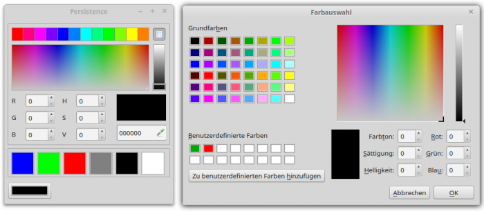
Figure 12.2.8.2.1: ColorButton dialogue (right)
So it was clear: The control element FMinimalColorChooser will be developed according to strategy 1 in the IDE of Gambas itself! The control element has these two properties:
| Property | DataType | Description |
|---|---|---|
| NumberOfColors | Integer | Sets the number of colours [1..12] in the colour palette or returns the number of colours. |
| ValueOfColor | Integer | Returns the colour value selected in the colour palette. |
Table 12.2.8.2.1 : Properties of the class FMCChooser
The control element FMinimalColorChooser has only the event Change. It is triggered when a colour in the colour palette has been selected with a mouse click - it has been changed:
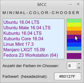
Figure 12.2.8.2.2: MiniColorChooser in action
To test the self-developed control element, a (main) form was designed so that the selected colour in the control element FMinimalColorChooser is used as the foreground colour for a text in a TextArea. In addition, the number of colours in the colour palette is displayed in a SpinBox, which can also be used to change their number in the specified interval [1|12]. The currently selected colour value is displayed in a TextBox (hexadecimal).
Source code:
[1] ' Gambas class file
[2]
[3] Private hMCChooser As FMinimalColorChooser ' ➘ Compound Control
[4]
[5] Public Sub Form_Open()
[6]
[7]   FMain.Resizable = False
[8]   panMCC.Arrangement = Arrange.Fill
[9] ' panMCC.Border = Border.Plain ' Option: Border around the embedded window
[10]   sboxNumberOfColors.MinValue = 1
[11]   sboxNumberOfColors.MaxValue = 12
[12]   txbColorHex.ReadOnly = True
[13]
[14]   hMCChooser = New FMinimalColorChooser(panMCC, 5) As "hMCChooser"
[15]
[16] ' Set selected properties of the embedded window of FMinimalColorChooser.
[17]   hMCChooser.Arrangement = Arrange.Vertical
[18]   hMCChooser.Spacing = True
[19] ' Set selected properties of control elements on FMinimalColorChooser,
[20] ' whose Public property was set to True at development time.
[21]   hMCChooser.dwgColors.Expand = True
[22]   hMCChooser.dwgColors.Border = Border.Solid
[23]   hMCChooser.panShowColor.Border = Border.Solid
[24]
[25]   hMCChooser_Change()
[26]
[27] End
[28]
[29] Public Sub hMCChooser_Change()
[30]   SetTAColor(hMCChooser.ValueOfColor)
[31]   txbColorHex.Text = "#" & Hex$(hMCChooser.ValueOfColor, 6)
[32]   sboxNumberOfColors.Value = hMCChooser.NumberOfColors
[33] End
[34]
[35] Public Sub sboxNumberOfColors_Change()
[36]   hMCChooser.NumberOfColors = sboxNumberOfColors.Value
[37] End
[38]
[39] Private Sub SetTAColor(FGColor As Integer)
[40]   TextArea1.Foreground = FGColor
[41]   txbColorHex.SetFocus()
[42] End
Comment:
- In lines 3 and 14, a new instance of the class FMinimalColorChooser is defined and created. The panel panMCC is specified as container and the number of colours in the colour palette as 2nd argument.
- Lines 29 to 33 define which reactions should occur when the Change event is triggered → change font colour in the TextArea, display the current colour value and update the value for the number of colours in the SpinBox.
- Changing the value in the SpinBox changes the value of the NumberOfColors property for the colour selection control.
The form for the control element looks less spectacular:
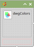
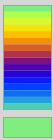
Figure 12.2.8.2.3: Form with DrawingArea and Panel (IDE and runtime).
The source code for the FMinimalColorChooser class is given in full:
[1] ' Gambas class file
[2]
[3] Property NumberOfColors As Integer    '' Number of colours, interval \[1..12\] (read + write)
[4] Property Read ValueOfColor As Integer '' Colour Value (Read Only)
[5]
[6] Private $iNumberOfColors As Integer
[7] Private $iValueOfColor As Integer
[8]
[9] Event Change
[10]
[11] Public Sub _new(Optional NumberOfColors As Integer = 6)
[12]   If Not IsMissing(NumberOfColors) Then $iNumberOfColors = NumberOfColors
[13] ' $iValueOfColor = GetColor(0) ' Option: Set start colour
[14] End
[15]
[16] Public Sub dwgColors_Draw()
[17]
[18]   Dim iY As Integer
[19]
[20]   Paint.LineWidth = dwgColors.H / $iNumberOfColors ' Relative width - related to DrawingArea
[21]   Paint.Translate(0, Paint.LineWidth / 2)
[22]   For iY = 0 To $iNumberOfColors - 1
[23]     Paint.Background = GetColor(iY)
[24]     Paint.MoveTo(0, iY * Paint.LineWidth)
[25]     Paint.LineTo(dwgColors.W, iY * Paint.LineWidth) ' Relative height - related to DrawingArea
[26]     Paint.Stroke()
[27]   Next
[28]
[29]   $iValueOfColor = GetColor(0)
[30]   UpdatePreviewColor()
[31]
[32] End
[33]
[34] Private Function GetColor(Ind As Integer) As Integer ' Generate colour palette
[35]
[36]   Dim fR, fG, fB As Float
[37]   Dim fFreq As Float = Pi(2) / $iNumberOfColors
[38]
[39]   fR = Sin(fFreq * Ind) * 127 + 128
[40]   fG = Sin(fFreq * Ind + Pi(1 / 3)) * 127 + 128
[41]   fB = Sin(fFreq * Ind + Pi) * 127 + 128
[42]
[43]   Return Color.RGB(fR, fG, fB)
[44]
[45] End
[46]
[47] Private Sub UpdatePreviewColor()
[48]   panShowColor.Background = $iValueOfColor
[49] End
[50]
[51] Public Sub dwgColors_MouseMove()
[52]   dwgColors_MouseUp()
[53] End
[54]
[55] Public Sub dwgColors_MouseUp()
[56]   $iValueOfColor = GetColor(Mouse.Y * $iNumberOfColors / dwgColors.H)
[57]   UpdatePreviewColor()
[58]   Raise Change ' The Change event is triggered
[59] End
[60]
[61] Private Function NumberOfColors_Read() As Integer
[62]   Return $iNumberOfColors
[63] End
[64]
[65] Private Sub NumberOfColors_Write(Colors As Integer)
[66]   If Colors < 1 Or colors > 12 Then Error.Raise(Subst$(("Invalid number: &1"), Colors))
[67]   $iNumberOfColors = Colors
[68]   dwgColors.Refresh() ' Colour palette is redrawn
[69] End
[70]
[71] Private Function ValueOfColor_Read() As Integer
[72]   Return $iValueOfColor
[73] End
Comment:
- First, the two properties NumberOfColors and ValueOfColors are declared in lines 3 and 4. The addition of 'Read' is necessary if the property ValueOfColors is to be read only.
- In the constructor _NEW(…), a starting value for the number of colours in the colour palette is specified as an optional argument with the number 8 and the function IsMissing() is used → http://gambaswiki.org/wiki/lang/ismissing.
- In lines 16 to 32, the colour palette is drawn. The number of colours is determined by the current value of the local variable i$NumberOfColors.
- Lines 51 to 59 ensure that a colour can be selected both by clicking on the embedded control element and by moving the mouse with the left mouse button pressed over the colour palette.
- Interesting is the error handling in line 66 within the procedure for setting the value of the NumberOfColor property in lines 65 to 69. An error is raised if the value is not in the interval from 1 to 255. In the project, the specifications for the minimum and maximum value of the SpinBox preventively ensure that the required range is adhered to.
12.2.8.3 Outlook Strategy 2
Things get really interesting when you put the class FMinimalColorChooser in a control element that can also be integrated into the collection of control elements (tool collection) with its own symbol:
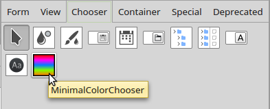
Figure 12.2.8.3.1: Tool collection (Chooser)
It is not until Chapter 30 that components, classes, modules and control elements are described in more detail under the aspect of object-oriented programming. To give you an insight into the strategy for developing and implementing self-developed control elements for the tool collection in the Gambas IDE, a suitable project by Tobias Boege is presented in the download area.
Please note: To integrate the control element MinimalColorChooser into the tool collection, the directory MinimalColorChooser has to be copied into the project directory which shall use the control element MinimalColorChooser.
The source code for the crucial MinimalColorChooser class looks like this:
' Gambas class file

Inherits UserControl
Export

Event Change

Public Const _Properties As String = "*,NumberOfColors=8"
Public Const _Group As String = "Chooser"
Public Const _Similar As String = "ColorChooser"
Public Const _DefaultEvent As String = "Change"

Property NumberOfColors As Integer
Property Read ValueOfColor As Integer

Private $hMCChooser As FMinimalColorChooser

Public Sub _new()
  $hMCChooser = New FMinimalColorChooser(Me, 6)
End

Public Sub Raise_ColorChange()
  Raise Change ' To be called from the FMinimalColorChooser
End

Private Function NumberOfColors_Read() As Integer
  Return $hMCChooser.NumberOfColors
End

Private Sub NumberOfColors_Write(Value As Integer)
  $hMCChooser.NumberOfColors = Value
End

Private Function ValueOfColor_Read() As Integer
  Return $hMCChooser.ValueOfColor
End
Download
k12/k12.2/k12.2.8/start.txt · Last modified: 01.02.2022 (external edit)
Page Tools
Except where otherwise noted, content on this wiki is licensed under the following license: CC Attribution-Noncommercial 3.0 Unported
