16.1 Label
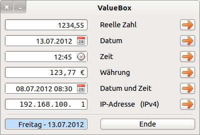
You can use a label to display descriptive text. Therefore, the Label.Text property is also the most important. For the ValueBox program, for example, six labels were used to display a description of the contents of the six ValueBoxes:
Figure 16.1.1: Six labels in action
The following table describes further properties of a label:
| Label | Data type | Default | Description |
|---|---|---|---|
| .Alignment | Integer | 0 | Sets the horizontal alignment of the label text or returns its alignment → class Align |
| .Autoresize | Boolean | False | Specifies whether the size of the label automatically adapts to the text. |
| .Border | Integer | None | Sets the border of the label or determines the border shape or specifies whether a border exists and which border shape is used → class Border |
| .Text | String | ~ | Sets or returns the text of the label to be displayed |
| .Padding | Integer | 0 | Sets a distance between text and label boundaries (edge) |
| .Transparent | Boolean | False | Sets the transparency of a label or specifies whether the label is transparent |
Table 16.1.1: Selected label properties
You can use the method Label.Adjust() to react if the text for a label has changed at runtime and the label size is to adapt automatically to the changed text. Text changes refer not only to the label text itself, but also to changes to the font properties of the label. Then it becomes increasingly difficult to maintain the design on the form.
Public Sub btnAdjust_Click()
  Label1.Text = "Neue IP-Adresse (IPv6)"
  Label1.Adjust()
End ' btnAdjust_Click()

Public Sub btnAutoResize_Click()
  Label1.AutoResize = True
  Label1.Text = "IP-Adresse (IPv4)"
End ' btnAutoResize_Click()
Alternatively, set the Label. AutoResize property to True and achieve the same effect.
You can only mark the text to be displayed using the Label.Font property with regard to font, style and size, and this always applies to the entiretext. Since the font color is not a font property, you must set it using the Label.Foreground property.
In the component 'StatusBar' of Raymonde de Bruijne, for example, 4 labels are used to display different information in 4 sections of the status bar:
Figure 16.1.2: Four labels in one StatusBar
In the following project the text “Running Text Speed” is used as descriptive text for the component Slider and a freely selectable text is displayed in another label as so-called Running Text:
Figure 16.1.3: Texts in two labels (→ 'Scrolling text')


