Sidebar
Table of Contents
16.5 ToolButton (gb. qt4)
This class implements a button for a ToolBar. A ToolButton can display an image, a text or both. In most cases, the text is dispensed with:
Figure 16.5.1: ToolButton and separators in a toolbar in the IDE
16.5.1 Properties
The properties of a ToolButton differ only slightly from the special properties of a' normal' button.
| Property | Data type | Default | Description |
|---|---|---|---|
| AutoResize | Boolean | False | Specifies whether the size of the ToolButton automatically adapts to the content (text/icon) |
| Action | String | Null | Sets the action string that is bound to the ToolButton or returns the string back |
| Caption | String | Null | Synonym for the text property |
| Text | String | Null | Sets the text to be displayed on the ToolButton or returns it back |
| Toogle | Boolean | False | With the value True the ToolButton has the properties of a Schalters |
| Value | Boolean | False | Sets the value of the ToolButton as a toggle button (locked or unlocked) or returns this value |
| Picture | Picture | Null | Sets the image to be displayed on the ToolButton or returns the image |
| ToolTip | String | Null | Sets or returns the ToolTipö text to be displayed |
Table 16.5.1.1: Selected button properties
You can use any icon on the button - it will be automatically stretched - provided that you only use ToolButton or MenuButton in the toolbar (ToolBar).
16.5.2 Events - Events
The click event is also the dominant event for a ToolButton. It is triggered when the user clicks with the mouse on the ToolButton or when the value of the. value property changes.
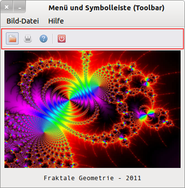
Section of a source code for a project in which 4 toolbuttons (→ Figure 16.5.3.1) are used:
[1] Public Sub tbImageOpen_Click()
[2]   ImageOpen()
[3]   mnu13Print.Enabled = True
[4]   tbPrint.Enabled = True
[5] End ' tbOpen_Click()
[6]
[7] Public Sub tbImagePrint_Click()
[8]   ImageOpen()
[9]   mnu13Print.Enabled = True
[10]   tbPrint.Enabled = True
[11] End ' tbOpen_Click()
[12]
[13] Public Sub tbHelp_Click()
[14]   FHelp.Show
[15] End ' tbOpen_Click()
[16]
[17] Public Sub tbFormClose_Click()
[18]   FHelp.Close
[19]   FMain.Close
[20] End ' tbOpen_Click()
16.5.3 Example
A tried and tested project for the use of a ToolBar with some ToolButtons can be found in → chapter 12.5 ToolBar. There you will find the complete source code, which is commented on in the relevant passages.
Figure 16.5.3.1: ToolButton and separators in a toolbar
Another project is described in chapter 18.6 Toolbar in connection with the properties, methods and events of the container component ToolBar.


