Sidebar
Table of Contents
16.4 ToggleButton (gb. qt4)
This class implements a ToogleButton - a switchable button that has two states: engaged and disengaged. A ToggleButton can display a text, an image or both.
16.4.1 Properties
The properties of a ToggleButton differ only in some of the properties of a button and these are specified in the table:
| Properety | Data type | Default | Description |
|---|---|---|---|
| Value | Boolean | False | If the value is set to True, the ToggleButton is activated - the switch clicks into place. |
| Radio | Boolean | False | Detects or determines whether a ToggleButton should behave like a RadioButton if at least 2 ToggleButtons are present in a container component. |
Table 16.4.1.1: Selected ToggleButton properties
16.4.2 Events
The click event is also the dominant event for a ToggleButton. It is triggered when the user clicks with the mouse on the toggle button or when the value of the. value property changes.
16.4.3 Example 1
Example 1 shows the use of a toggle button in the source code section, which can be used to set two different print modes. The ToggleButton displays two different icons and tooltip texts depending on the switching status. The source code contains only the relevant sections of a project for printing images, which is fully described in chapter 23.6.1:
Public Sub Form_Open()
...
  togbtnColorModus.Picture = Picture["icon:/16/fill"]
  togbtnColorModus.Tooltip = "FarbModus: Farbdruck"
  myPrinter.GrayScale = False
...
End ' Form_Open()


Public Sub togbtnColorModus_Click()

  If togbtnColorModus.Value = True Then
     togbtnColorModus.Picture = Picture["icon:/16/properties"]
     togbtnColorModus.Tooltip = "FarbModus: Graustufen"
     printerImage.GrayScale = True
  Else
     togbtnColorModus.Picture = Picture["icon:/16/fill"]
     togbtnColorModus.Tooltip = "FarbModus: Farbe"
     printerImage.GrayScale = False
  Endif ' togbtnColorModus.Value = True ?

End ' togbtnColorModus_Click()
16.4.4 Example 2
If you use the TextArea component to display single-color text, the text is wrapped after a line end character. If the paragraph is longer, you may have to scroll right through the text to read it completely. You can prevent this behavior by using the TextArea.Wrap = True property to specify that the text is wrapped before the word which can no longer be displayed completely in the relevant line. Attention: There is no automatic hyphenation!
Source code extract:
Public Sub Form_Open()
...
  ToggleWrapping.Text = "Switch on wrapping"

...
End ' Form_Open()

PUBLIC SUB ToggleWrapping_Click()

  If ToggleWrapping.Value Then
     ToggleWrapping.Text = "Switch off wrapping"
     TextArea.Wrap = True
  Else
     ToggleWrapping.Text = "Switch on wrapping"
     TextArea.Wrap = False
  Endif ' ToggleWrapping.Value = True ?

END ' ToggleWrapping_Click()
It is not a good plan to use “Wrapping on” or “WordWrapping off” as a label, for example, because it is not possible to decide whether it is a status or a request.
16.4.5 Example 3
With the property ToggleButton. Radio you can specify that a group of at least 2 ToggleButtons in a container component behaves like a RadioButton: Only a ToggleButton from the group can be activated.
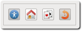
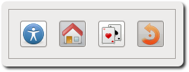
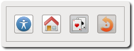
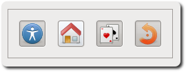
Four toggle buttons are placed on a panel. The first three form a group and the first button is engaged. The ToggleButton number 4, on the other hand, has its own ToggleButton life, independent of the states of the first three and is engaged when the program is started:
[1] Public Sub Form_Open()
[2] ...
[3]   ToggleButton1.Radio = True
[4]   ToggleButton2.Radio = True
[5]   ToggleButton3.Radio = True
[6]   ToggleButton1.Value = True
[7]
[8]   ToggleButton4.Value = True
[9]
...
[10] End ' Form_Open()
Figure 16.4.5.1: ToggleButton on a panel
Comments:
- Only one of the first three toggle buttons is engaged at a time. If you change the property values in lines 3 to 5 from True to False, you can switch the first three ToggleButtons separately again (→ Figure 4) which actions you assign to each ToggleButton is determined by the tasks to be solved.


