Table of Contents
23.8.2 Projects Column charts
When preparing the chapters and testing corresponding projects for the gb.chart component, it became apparent that it contained a number of errors. This is also the reason why the status of the component is set to 'experimental' (as of March 2024).
In lively dialogue with Fabien Bodard, the developer of the chart component, the two chart types 'column chart' and 'pie chart' were developed separately. The classes presented in this and the next chapter are extractions of revised classes from the original gb.chart component that have not yet been published.
The selected chart classes have been tested by the authors in a proven manner. Existing errors have been eliminated and the source text has been commented in the most important passages. The two projects on column charts and the project on pie charts in section 23.8.3 are linked to the expectation that the revised classes will be used successfully in user projects.
23.8.2.1 Column chart 1 project
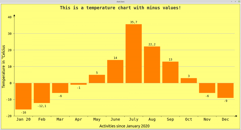
The data in the following table with a data series can be visualised very effectively in a bar chart:
| Month | Jan | Feb | Mar | Apr | May | June | July | Aug | Sep | Oct | Nov | Dec |
|---|---|---|---|---|---|---|---|---|---|---|---|---|
| T in °C | -16 | -12.1 | -6 | -1 | 5 | 14 | 35.7 | 22.2 | 13 | 3 | -6 | -9 |
Table 23.8.2.1.1: Time-temperature table
Figure 23.8.2.1.1: Bar chart (SingleChart)
The following procedure has proven itself:
- First, the data series with k data is defined in a float array. The identifier of one series can also remain empty as it is not displayed.
- Then the k arguments are defined in a string array.
- The colours for the chart background and for the columns are then defined.
- A meaningful title is then assigned to the chart.
- Finally, the properties that define the style of the chart are determined. This also includes the two identifiers for the x-axis and the y-axis.
This is the complete, sufficiently commented source code for a bar chart with a data series:
' Gambas class file

Private hChart1 As New Chart

Public Sub Form_Open()
    GenerateChart()
End

Private Sub GenerateChart()

    hChart1.SetStyle("Bar")

'-- Y-Values
'-- If only one data series was defined, then the text can be empty: ""
'-- You can use the class like a function - by _call(arg_list) in the class ChartDatas
    hChart1.Datas = [ChartDatas("", [-16, -12.1, -6, -1, 5, 14, 35.7, 22.2, 13, 3, -6, -9])]

'-- X-Values
    hChart1.Labels = ["Jan 20","Feb","Mar","Apr","May","June","July","Aug","Sep","Oct","Nov","Dec"]

    hChart1.Border = True

    hChart1.Background = Color.Lighter(Color.Yellow)

'-- Uniform color of individual columns in *one* data series
    hChart1.Colors = [Color.Orange]

'-- A legend is omitted from a single series
    If hChart1.Datas.Count = 1 Then
       hChart1.Legend.Visible = False
    Else
       hChart1.Legend.Visible = True
       hChart1.Legend.Position = Align.Right
       hChart1.Legend.Title = "Legend"
    Endif

    hChart1.Title.Visible = True
    hChart1.Title.Font.Name = "NotoSans"
    hChart1.Title.Text = "This is a temperature chart with minus values!"

'-- AutoScale the fonts via an internal ratio like in a spreadsheet
'-- so the chart always look good even if the device size change
    hChart1.AutoScale = True

    With hChart1
      .Style!Y_MaxValue = 40
      .Style!Y_MinValue = -20
      .Style!Y_Pattern = "0" ' "0.0", "0.00"
      .Style!Y_Font = Font["NotoSans,+2"]
      .Style!Y_Label = "Temperature in °Celcius"
      .Style!Y_Step = 10

      '------------------------------------------------
      .Style!X_Font = Font["NotoSans"]
      .Style!X_Label = "Activities since January 2020"
      '------------------------------------------------

      .Style!Padding = 10
      .Style!ShowValues = True
      .Style!Border = False
      .Style!ShowArrows = True
      .Style!ShowInterlines = True
      .Style!BarFont = Font["NotoSans, 10"]
      .Style!BarWidth = 0.88
      .Style!BackGround = Color.Lighter(Color.Lighter(Color.Yellow))
      .Style!InterlinesColor = Color.Lighter(Color.Blue)
    End With

End

Public Sub dwaSimpleReihesChart_Draw()

    hChart1.Paint(0, 0, Paint.Width, Paint.Height)

End
23.8.2.2 Project bar chart 2
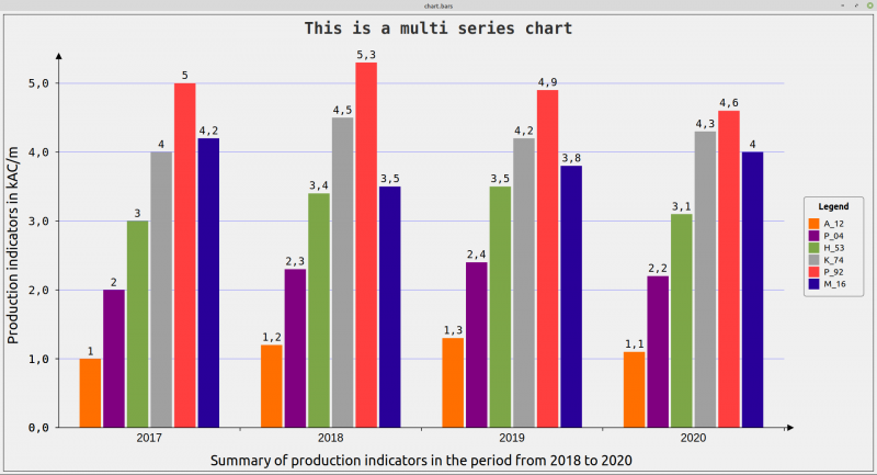
The difference between the two projects presented is that only one data series is used in the first project 'Column chart SingleChart', while several data series are used in the second project 'Column chart MultiChart'. A legend is mandatory in order to clearly label the data in a series using different identifiers such as “P_04” or “M_16”. You must also give each data series a unique identifier such as “2017” to “2020” - as shown in Figure 23.8.2.2.1.
Figure 23.8.2.2.1: Bar chart (MultiChart) with legend
This is the complete, sufficiently commented source code for a bar chart with 4 data series:
' Gambas class file

Private hChart As New Chart

Public Sub Form_Open()

'-- Specifying colors for the individual data rows instead of the default colors
'-- hChart.Colors = [&he6e64c, &hff9966, &h808080, &habc123, &h00ffff, &h9999ff]
    GenerateChart()
End

Private Sub GenerateChart()

    Dim hChartData1, hChartData2, hChartData3, hChartData4 As ChartDatas

'-- Settings the function values of the single data Reihes
    hChartData1 = ChartDatas("2017", [1.0, 2, 3, 4, 5, 4.2])
    hChartData2 = ChartDatas("2018", [1.2, 2.3, 3.4, 4.5, 5.3, 3.5])
    hChartData3 = ChartDatas("2019", [1.3, 2.4, 3.5, 4.2, 4.9, 3.8])
    hChartData4 = ChartDatas("2020", [1.1, 2.2, 3.1, 4.3, 4.6, 4])

    hChart.Datas = [hChartData1, hChartData2, hChartData3, hChartData4]

'-- Setting essential properties
    hChart.SetStyle("Bar")
    hChart.AutoScale = True
    hChart.Border = True

'-- Chart-Legend
    hChart.Legend.Position = Align.Right
    hChart.Legend.Visible = True
    hChart.Legend.Title = "Legend"

'-- Setting the arguments for the Legend
    hChart.Labels = ["A_12", "P_04", "H_53", "K_74", "P_92", "M_16"]

'-- Chart-Caption
    hChart.Title.Text = "This is a multi Reihes chart"
    hChart.Title.Font.Name = "NotoSans"
    hChart.Title.Visible = True

    With hChart
      .Style!Y_AutoScale = True
      .Style!Y_Step = 1
      .Style!Y_Font = Font["NotoSans,+2"]
      .Style!ShowValues = True
      .Style!Y_Pattern = "0.0"
      .Style!Y_Label = "Production indicators in kAC/m"
      '----------------------------------------------------------------------------------
      .Style!X_Label = "Summary of production indicators in the period from 2018 to 2020"
      .Style!X_Font = Font["NotoSans,+2"]
      '----------------------------------------------------------------------------------
      .Style!Padding = 10
      .Style!BarFont = Font["NotoSans, 9"]
      .Style!Border = False '
      .Style!ShowArrows = True
      .Style!ShowInterlines = True
      .Style!InterlinesColor = Color.Lighter(Color.Blue)
      .Style!BarWidth = 0.9
      .Style!ReihesPadding = 1.3
    End With

    dwaMultiReihesChart.Refresh()

End

Public Sub dwaMultiReihesChart_Draw()
  hChart.Paint(0, 0, Paint.Width, Paint.Height)
End
Notes:
- As you can see, 4 data series are defined, each of which has its own identifier (in this case the year).
- The entries in the legend are made using 6 individual identifiers because 6 values are displayed for each data series.
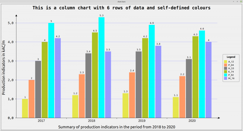
- The colours of the individual columns cannot be defined individually ad hoc in the above source text. With the information that the Chart class (chart.class) has the 'Colors' property of the integer array data type - which you can read and write - this one line in the Form_Open() procedure is sufficient:
hChart.Colors = [&he6e64c, &hff9966, &h808080, &habc123, &h00ffff, &h9999ff]
to define your own colours for the 6 data rows:
Figure 23.8.2.2.2: Column chart (MultiChart) with self-defined colours
This idea is already implemented and commented on in the attached project.


