Table of Contents
17.13 DateChooser
The DateChooser (gb.form) component implements a calendar. This calendar allows the user to select a date, time or both in a calendar → mode property. The display properties for a selected date in the DateChooser can be defined via the Data property and via the Data event. The ideal width of a DateChooser component is at least 296 pixels, because only then you have access to all the selection and navigation options offered.
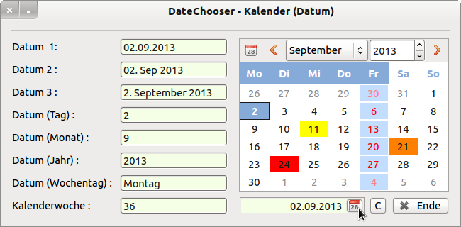
Figure 17.13.1: DateChooser component and DateBox (display)
No separate chapter has been devoted to the DateBox component. The class DateBox contains only one ButtonBox → Chapter 16.8 ButtonBox, whose mask has been set to date and time information and opens a dialogue with DateChooser. By using the DateChooser component, you are on the safe side when it comes to using valid values for a date or time specifications (in the 30-minute grid) in a Gambas project. If you want it to be small and fine, then you cannot avoid using a DateBox.
17.13.1 Properties and methods DateChooser
Selected properties are listed and described in the following table:
| Property | Type | Default | Description |
|---|---|---|---|
| Value | Date | Now() | Returns the selected date |
| Day | Integer | - | Returns the day of the selected date. |
| Month | Integer | - | Returns the month of the selected date. |
| Year | Integer | - | Returns the year of the selected date. |
| Mode | Integer | 0 | Determines whether a date, a date and time or only times are displayed in the calendar (constants: DateOnly (0), DateTime (1) or TimeOnly (2)). |
| Data | _DateChooser_Data | - | This virtual class allows the definition of how to format a specific date. The properties must be set within the data event handler. |
| Colors | _DateChooser_Colors | - | This virtual class allows the colour definition of how to colour format a specific date. |
Table 17.13.1.1: Selected properties of the DateChooser component
The _DateChooser_Data virtual class defines:
- Background: the default value is Color.Default, which means that no specific background colour is used.
- Foreground : The default value is Color.Default, which means that no specific foreground colour is used.
- Font : The default value (NULL) means that no specific font is used.
- Text: This property is not currently used.
The DateChooser class has only one designated, special method, DateChooser.SetFocus(), which sets the focus on the DateChooser component.
17.13.2 DateChooser events
Special events of the DateChooser component can be found here:
| Event | Description |
|---|---|
| Activate | Triggered when the user double-clicks on a date in the DateChooser. |
| Cancel | Triggered when the user pressed the ESC key to cancel their selection. |
| Change | Triggered when the date in the calendar is changed. |
| Data(Date As Date) | This event is triggered to find out how a certain date should be displayed in the calendar. Fill the Data property with the required information. |
Table 17.13.2.1: Overview of the 4 special events of the DateChooser component.
17.13.3 Project 1 DateChooser
The main focus of the presented project is, on the one hand, to introduce you to the use of the 2 virtual classes with their properties and methods in connection with the event DateChooser1_Data(dValue As Date) and, on the other hand, to show you how to store a selected date in the calendar in a variable or how to display it in suitable components.
Figure 17.13.1 shows the programme interface. The source code for project 1 is given in full and commented on in detail:
[1] ' Gambas class file
[2]
[3]  Public dDatum As Date
[4]
[5] Public Sub Form_Open()
[6]   FMain.Center()
[7]   FMain.Resizable = False
[8] ' Mode-Konstanten stehen in der DateChooser-Klasse und nicht in der DateBox-Klasse!
[9]   DateBox1.Mode = DateChooser.DateOnly
[10]   DateChooser1.Mode = DateChooser.DateOnly
[11]   DateBox1.Value = Now()
[12]   GetDateValues()
[13]
[14]   DateChooser1.Colors["9/21/2013"] = Color.Orange ' Datum in englischer Notation!
[15]   DateChooser1.Colors["9/11/2013"] = Color.Yellow
[16]   DateChooser1.Colors["9/24/2013"] = Color.Red
[17]
[18] End
[19]
[20] Public Sub btnClearColors_Click()
[21]   DateChooser1.Colors.Clear()
[22]   DateChooser1.SetFocus()
[23] End
[24]
[25] Public Sub DateChooser1_Activate() ' Einfach-Klick
[26]    DateChooser1_Change()
[27] End
[28]
[29] Public Sub DateChooser1_Change()
[30]   GetDateValues()
[31]   DateBox1.Value = DateChooser1.Value
[32] End
[33]
[34] Public Sub DateBox1_Activate() ' Doppel-Klick!
[35]   DateBox1_Change
[36] End
[37]
[38] Public Sub DateBox1_Change()
[39]  GetDateValues()
[40]  DateChooser1.Value = DateBox1.Value ' Synchronisation DateChooser → DateBox
[41] End
[42]
[43] Private Sub GetDateValues()
[44]   Dim aWochentage As String[]
[45]
[46]   dDatum = DateChooser1.Value
[47]
[48]   txtDate.Text = Format(DateChooser1.Value, "dd.mm.yyyy")
[49]   txtDate2.Text = Format(DateChooser1.Value, "dd. mmm yyyy")
[50]   txtDate3.Text = Format(DateChooser1.Value, "d. mmmm yyyy")
[51]
[52]   txtDateDay.Text = DateChooser1.Day
[53]   txtDateMonth.Text = DateChooser1.Month
[54]   txtDateYear.Text = DateChooser1.Year
[55]
[56] ' aWochentage=["Sonntag","Montag","Dienstag","Mittwoch","Donnerstag","Freitag","Samstag"]
[57] ' txtDateDayOfWeek.Text = aWochentage[WeekDay(DateChooser1.Value)] ' Sonntag = 0
[58]   txtDateDayOfWeek.Text = Format(DateChooser1.Value, "dddd")
[59]   txtDateWeekNumber.Text = Week(DateChooser1.Value, gb.Monday, False)
[60]
[61] End
[62]
[63]  Public Sub DateChooser1_Data(dValue As Date) ' dValue frei gewählter Variablenname
[64]
[65] ' If Month(dValue) = 12 And If Day(dValue) = 7 Then ' Genau 1 Wert
[66] ' If Day(dValue) = 12 Then ' Genau 12 Werte
[67]   If WeekDay(dValue) = gb.Friday Then ' Mehr als 50 Werte ...
[68]      DateChooser1.Data.Background = &HC3DDFF
[69]      DateChooser1.Data.Foreground = Color.Red
[70]      DateChooser1.Data.Font = Font["Italic"]
[71]   Endif
[72]
[73] End
[74]
[75] Public Sub btnClose_Click()
[76]   FMain.Close
[77] End
Comments:
- In line 3, a project-wide variable dDatum of the data type Date is declared, to which the date selected in the calendar is assigned in line 46.
- The DateBox component must be given a start value (line 11), while the DateChooser component is automatically initialised with the current system date.
- The DateChooser.Colors.Clear method of the virtual class _DateChooser_Colors resets the background colour value (line 21) to the default value of the ColorChooser component, which was set for example with DateChooser1.Colors[“9/21/2013”] = Color.Orange for the date 9/21/2013 → line 14.
- While the variable dDatum is assigned the date of the type Date, most (display) components - except for the DateBox - require the conversion from the data type Date to the data type String. In the self-defined procedure GetDateValues() in lines 43 to 61, both the complete date, the day, the month and the year as well as the day of the week and the calendar week are formatted in a suitable way, whereby the format function offers the greatest variety.
- In line 59, the calendar week is calculated from the selected date (1st argument) and the following arguments are optional. By specifying the 2nd argument the first day of the week is defined and with the 3rd argument the counting method for the calendar weeks. If FullWeek is False, the first partial week of the year is counted if it has at least four days in the (new) year.
- In lines 63 to 73, the DateChooser_Data(Date As Date) event specifies how certain date values are to be formatted. Attention: You must specify a freely selectable name for the (symbolic) name of the variable of the data type Date, which is different from Date, because otherwise there will be an error message! With the variable name dValue you are spot on.
- In lines 68, 69 and 70, use 3 selected properties of the virtual class _DateChooser_Data to define the format of the date values that fit the selection - here it is Fridays - in line 67 → Figure 17.13.1.
17.13.4 Project 2 DateChooserT
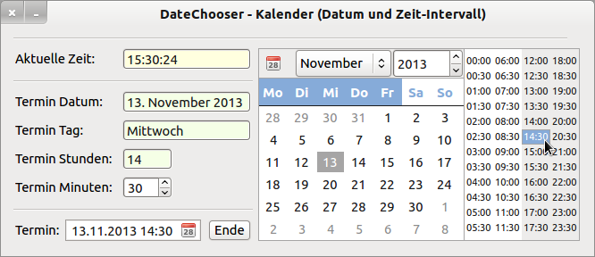
If you set the DateChooser.Mode property to DateChooser.DateTime, the DateChooser component is the first choice for setting dates and times:
Figure 17.13.4.1: DateChooser component - Date 1
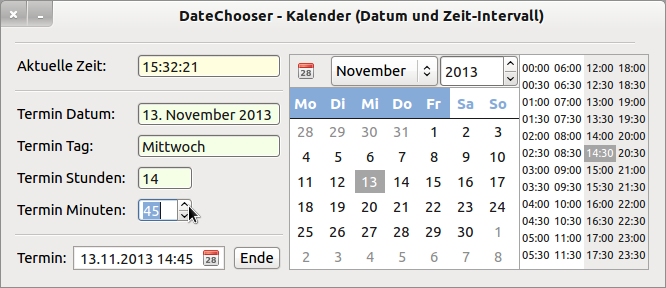
You select the date with a (single) click and the start for the time interval with a double click. In addition, you can set the appointment to the minute in this project, if this is required. The selected appointment (date, start time interval, minutes in the SpinBox (optional)) is displayed in a DateBox and stored in the variable dEvent of the data type Date.
Figure 17.13.4.1: DateChooser component - Date 2
Project 2 can be found in the download area.


