Table of Contents
12.7 Class TabPanel (gb.form)
The TabPanel (gb.form) class implements a tab control. This control is a TabStrip replacement with a fine border around the tab tabs.
If you are working with the two controls TabStrip and TabPanel, the question quickly arises whether you should prefer a TabPanel to a TabStrip. The decision will be easier if you know the following facts:
- TabStrip (gb.qt4) is a native QT class over which the Gambas developers have little influence.
- TabPanel, on the other hand, is a class in gb.form written in Gambas. So it is easier to implement a new feature in TabPanel.
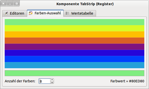
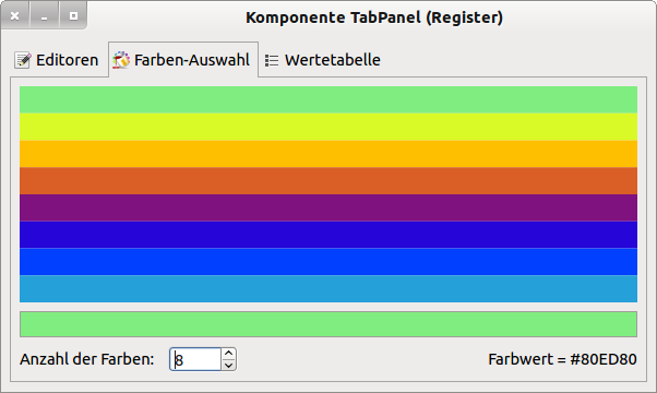
- A TabPanel has more properties than a TabStrip: TabPanel.Highlight → Figure 12.7.2 and TabPanel.Moveable.
- Only the TabPanel has the event TabPanel.CloseAll.
- A TabStrip has the method TabStrip.FindIndex(..), which does not exist for a TabPanel.
- The method Remove(Index As Integer) only exists for a TabPanel.
12.7.1 Properties
In the following next section, only the additional properties of the TabPanel (gb.form) class - compared to the TabStrip (gb.qt4) class - are presented:
| Property | DataType | Description |
|---|---|---|
| Highlight | Boolean | For the value 'True', sets the background of the inactive tabs to dark grey → Figure 12.7.2 to make the active tab more visible or returns the value. |
| Moveable | Boolean | Specifies with the value 'True' whether the tabs can be rearranged (moved) with the mouse via the tab tab or returns the value. |
Table 12.7.1.1 : Selected properties of the class TabPanel
12.7.2 Methods
The methods of the TabStrip class have been extended to include the TabPanel.Remove (gb.form) method:
Sub Remove (Index As Integer)
With this method you remove the tab panel with the specified index from the tab, provided that the tab panel does not contain any controls. Otherwise you will get the error message “TabPanel container is not empty”.
12.7.3 Project
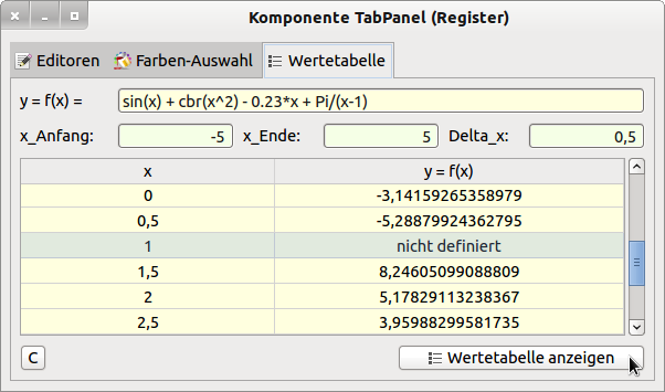
The project presented is based on the TabStrip project in → Chapter 12.6.2. The two properties TabPanel.Highlight and TabPanel.Moveable were additionally used. The source code can be read when testing the project because it is displayed in an editor at runtime. The following pictures give an impression of the layout of the 3 tab cards on the TabPanel.
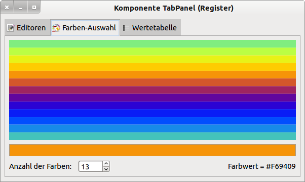
Figure 12.7.3.1: Original arrangement of the tab cards with TabPanel.Highlight = True.
If you switch to the first tab panel, you will see a small section of the project source text. You can also see the changed arrangement of the tabs (below) for the 2nd tab with two tabs, where the property TabPanel.Highlight was not set.

Figure 12.7.3.2: Displaying project source text in an editor
However, you can also view the source text legibly in a TextArea if you maximise the programme window:
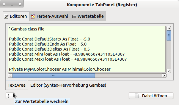
Figure 12.7.3.3: Alternative display of project source text in an editor
Use the button at the bottom left to switch immediately to tab 3 (index = 2) and call up the arguments x and the function values f(x) there with the preset function and the specified argument interval and step size for the arguments in a value table. Note that internally a check is made for valid function values - but that is already out of the scope of TabPanel!
You can move the tab tab - and thus the tab card - with the text 'Colour selection' to the right, for example, by holding down the mouse button, because the property TabPanel.Moveable has been set to the value True, and you will then get this changed arrangement of the tab cards compared to the original → Figure 12.7.3.1:
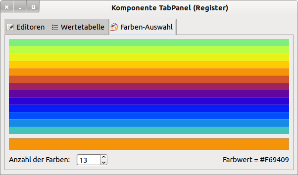
Figure 12.7.3.5: Moving the 'Colour selection' tab to the right.
Hint:
The possibility of moving register cards at runtime must be responded to appropriately when switching to the register card with the value table → Figure 12.7.3.3, as its index then changes:
Public Sub btnSwitchToTabWT_Click()
  Dim i As Integer

  For i = 0 To TabPanel1.Count - 1
    If TabPanel1[i].Text = WT_CAPTION Then '  WT_CAPTION = "Table of values"
       TabPanel1.Index = i
       Break
    Endif
  Next

End ' btnSwitchToTabWT_Click()
